case study:
Crispin Hard Cider
A detailed look at branding and packaging design for a line of hard ciders.
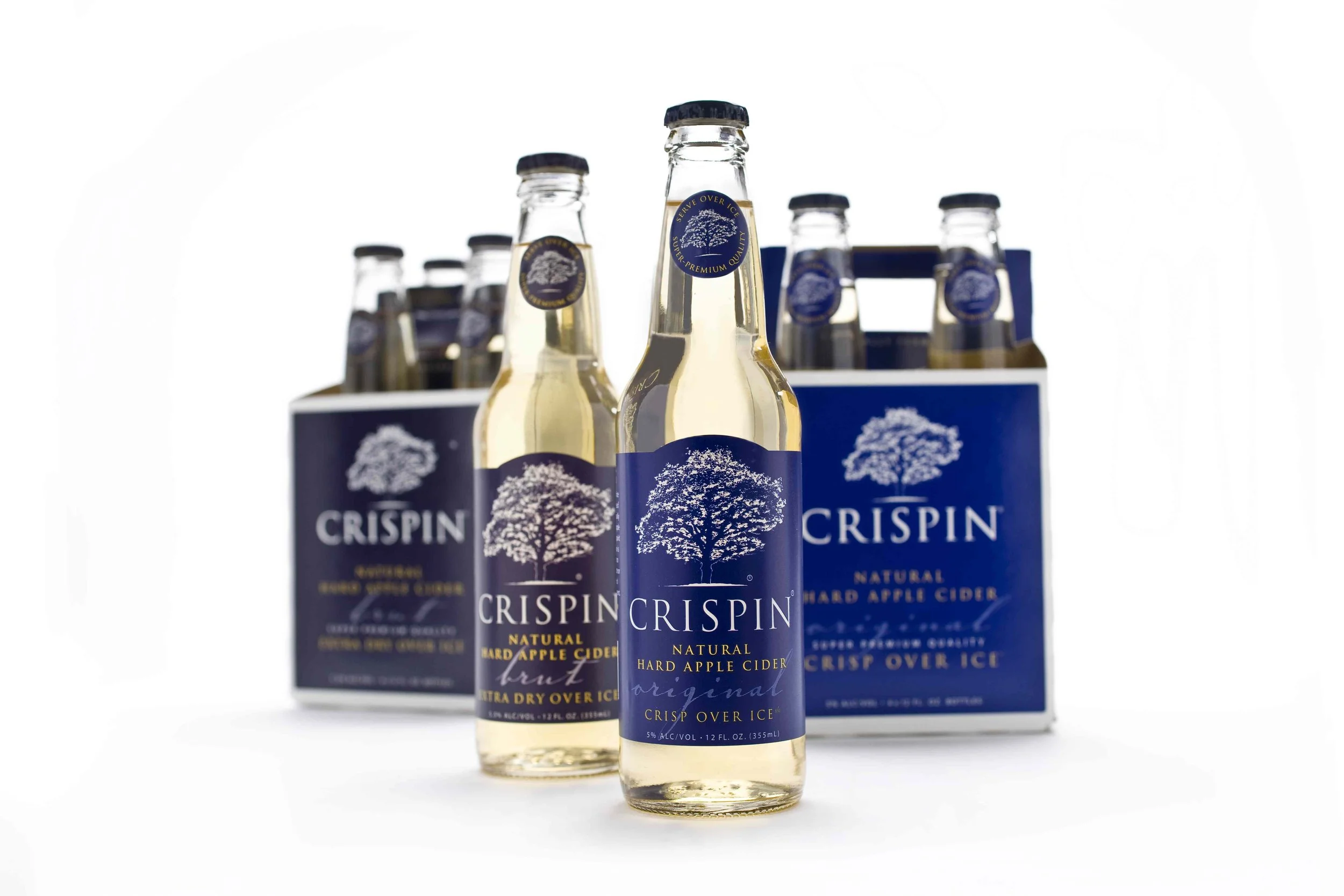
The entrepreneur behind Crispin was no stranger to the beverage world—having already built a successful brand, he came to us with the name 'Crispin' in place and a strong, distinctive vision. Our task: bring that vision to life by developing the full Crispin brand, including three unique flavor profiles, packaging design, and launch-ready advertising concepts.
Brand Strategy & Research
Market Research: Studied competitors in the hard cider industry, market trends, target demographics, and consumer preferences.
Product Definition: A sparkling hard cider, served over ice
Brand Positioning: Refreshing, light, elegant, experience oriented by serving over ice in a Crispin branded glass
Target Audience: Leans feminine, an alternative to the more masculine hard cider brands, someone who would want an alternative to wine or beer
Brand development
Part of the client’s vision included a preliminary logo design he had already commissioned. While it provided a helpful starting point, we felt it didn’t quite capture the spirit of the product. So we began exploring new directions—eventually returning to the concept of a tree. This time, we focused on refining it into something more fitting: an apple tree that felt crisp, refreshing, and emblematic of the brand.

From there, we shifted focus to the brand’s three flavor profiles—Brut, Original, and Light—each expressed through distinct shades of blue. I developed the color palette, designed the bottle labels, and then moved on to packaging for the 4-packs. A key differentiator was the brand’s recommendation to serve the cider over ice, which we emphasized through carefully styled photography—capturing just the right sparkle in the glass and the glint of the ice cubes.
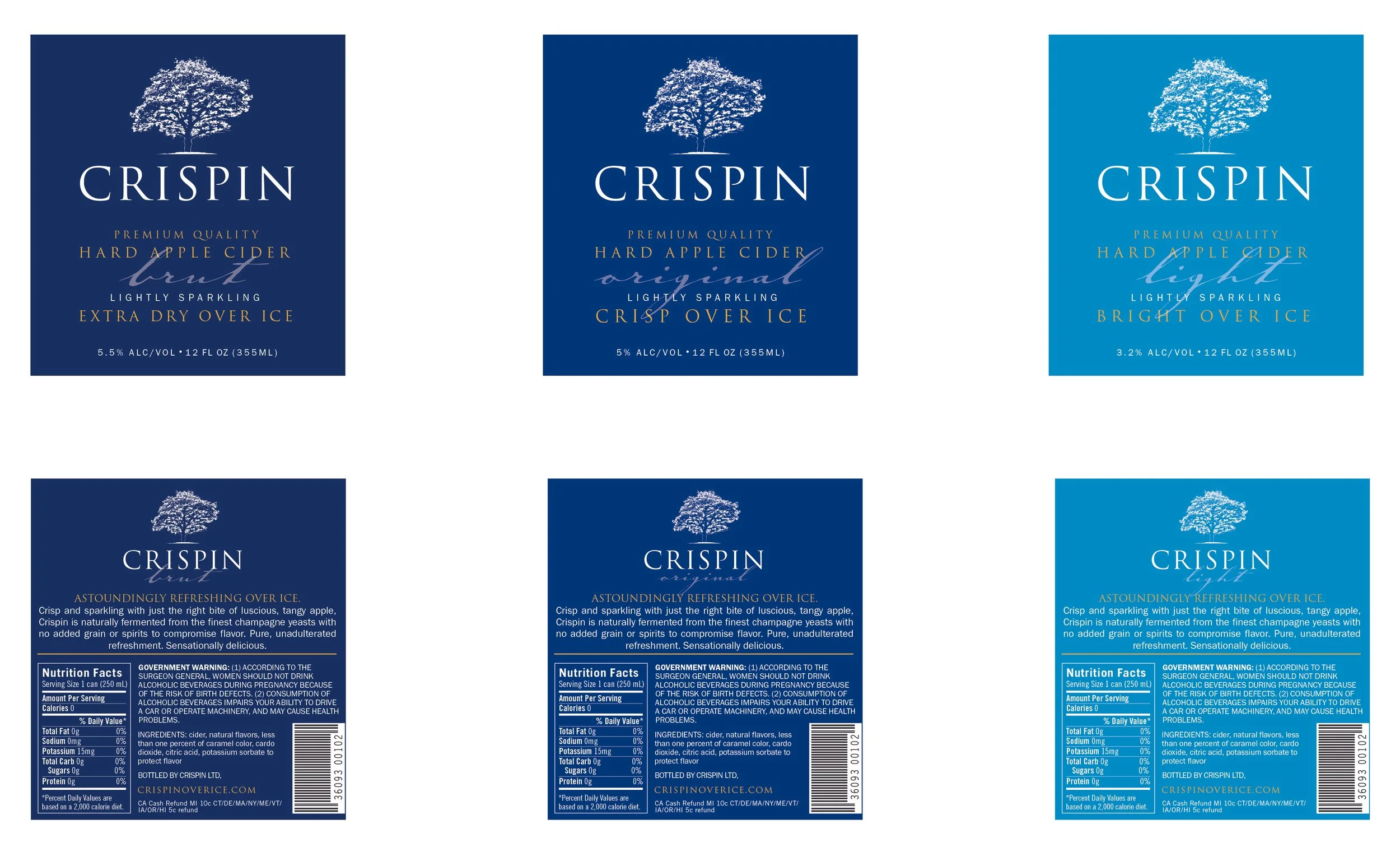
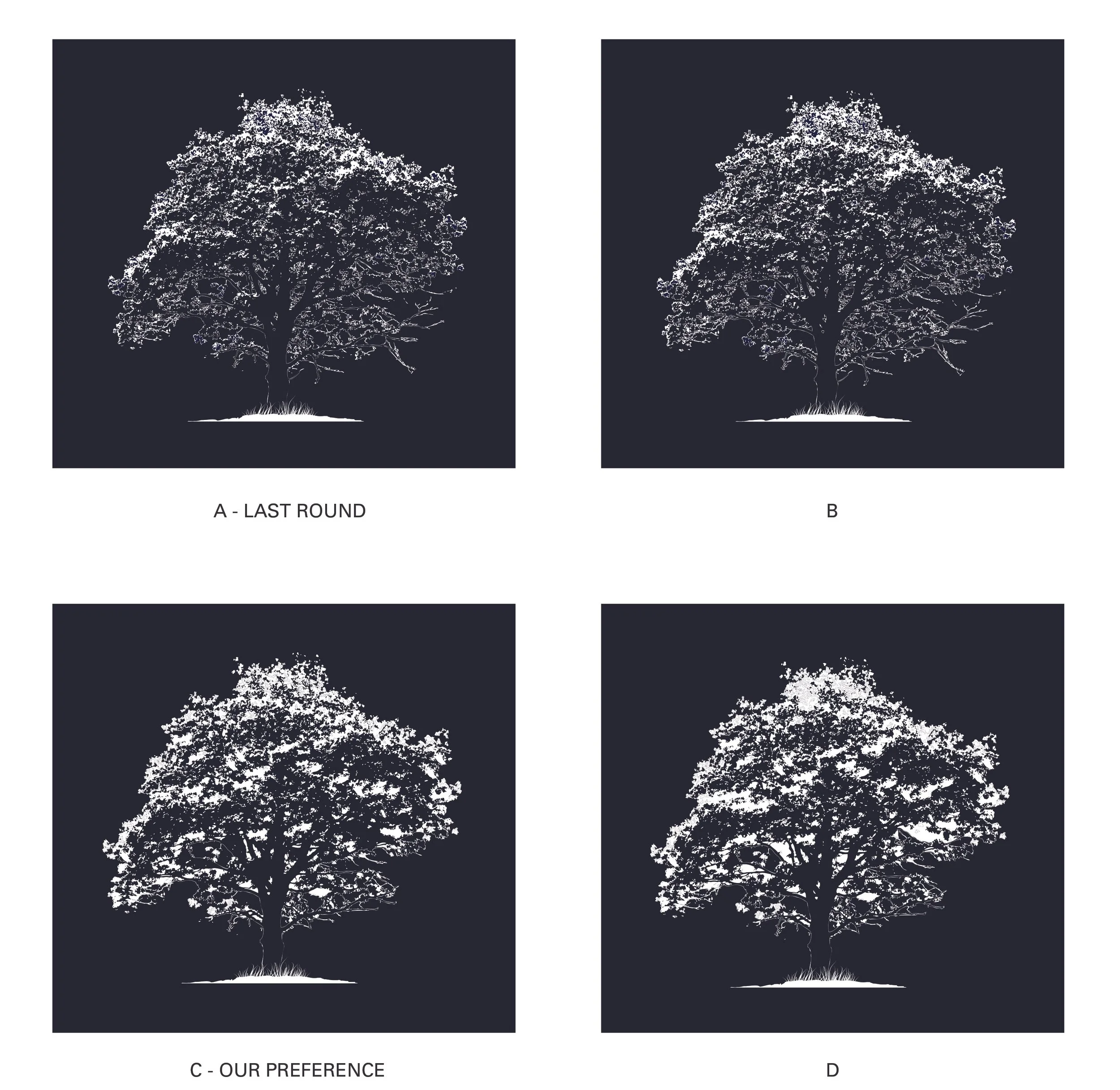
Crafting the tree illustration became the most time-intensive part of the entire project. I spent weeks fine-tuning the details, working closely with the client to bring the vision to life. Like most designers, I never felt it was quite finished—I could’ve kept tweaking it long after it went to production.
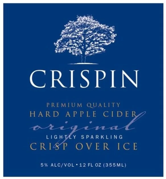
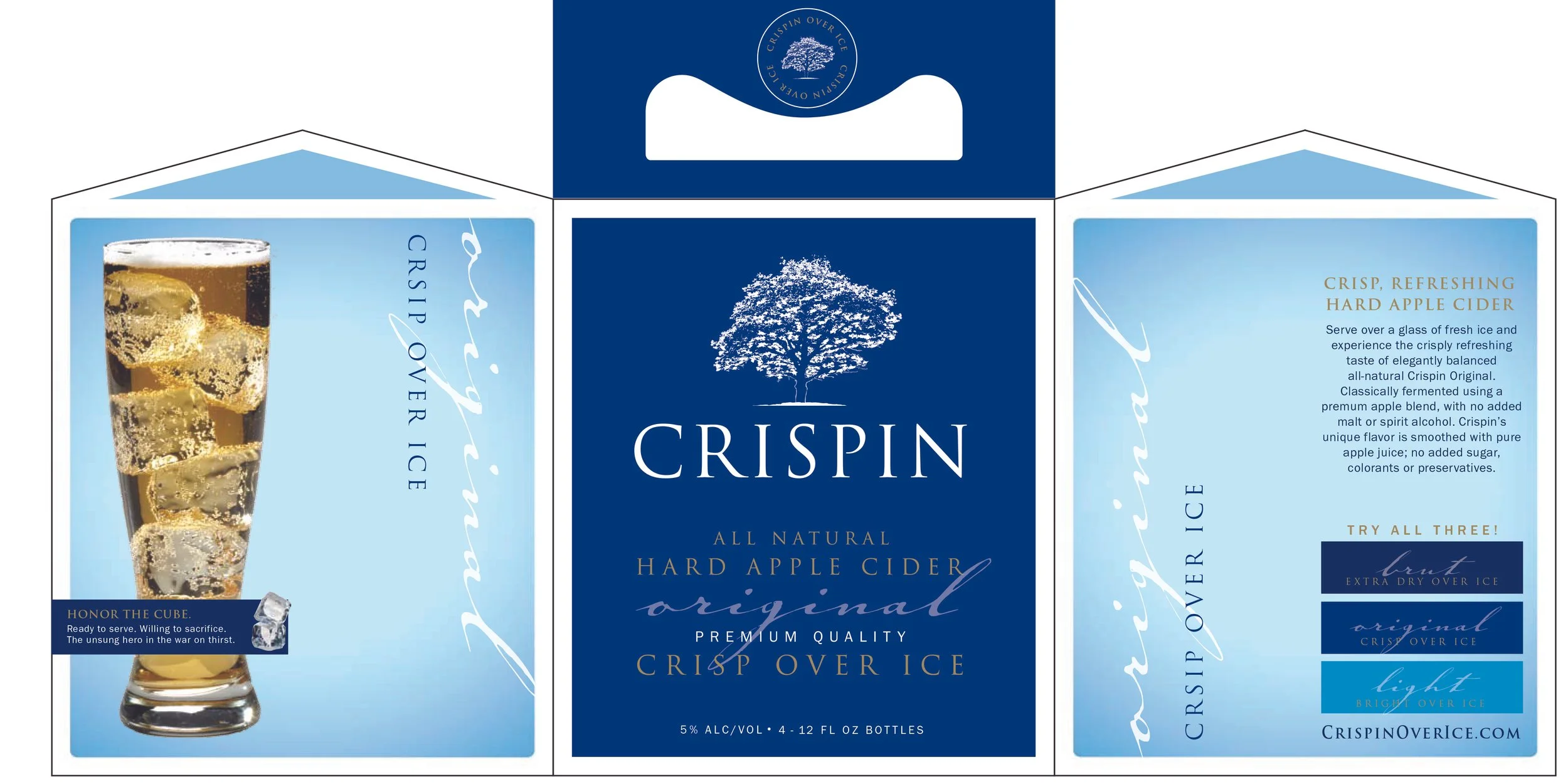
FINAL DESIGN
A few years after the product launch, Crispin Hard Cider was bought by MillerCoors - an example of good branding that works!